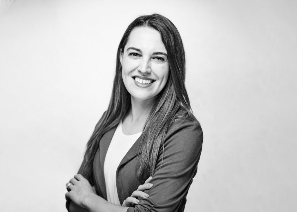
We recently brought on Melissa Gaddis as our Design Architect. She’ll play a pivotal role at STRUCK in bringing a brand’s story to life through innovative architectural design and spatial planning. We’re stoked to build stuff together. Meet Melissa!
What inspired you to pursue a career in architecture?
I was inspired to become an architect after attending a “Build a City” class at a local community college summer program at age 12. Architecture felt like the perfect blend of logical problem solving and creativity for me. From then on I knew I wanted to make an impact on the world by creating beautiful spaces and experiences for people.
Can you share a memorable project where you were able to merge form with function successfully?
In every project, my goal is to ensure that form and function are not just compatible but enhance each other. One of my favorite forms was the Speed Skating Oval Training Facility, which had a really dynamic shape to match what was going on inside the building. I also really enjoyed creating a round three-story office space that was all glass. It really took advantage of the surrounding views and landscape and gave those views to all employees, while still having a functional feel to all spaces inside the building.
How do you approach balancing creativity with practicality in your design process?
Establishing client goals at the outset is crucial. Once those goals are clearly defined, it opens up a space for creativity, allowing us to present innovative solutions while staying grounded in practical outcomes that meet the client’s needs.
What excites you the most about working at STRUCK?
What really excites me is the opportunity to dive into custom detailing. I’m looking forward to experimenting with inventive design solutions that push the boundaries of what we can achieve, while also working with a diverse array of clients and unique project types that keep things fresh and challenging.
Can you walk us through your creative process when developing a brand’s story through architectural design?
At the start of the process, I like to engage in a hands-on, collaborative visioning and programming session. This helps to gain a deep understanding of the various user groups and what they envision for the space, brand, and overall experience. Once those goals and visions are clearly defined, I focus on user needs—identifying essential spaces and how they will interact. From there, I present initial architectural precedents, walking the client through different designs to get feedback on what resonates and what doesn’t. This helps refine their style and aesthetic preferences. With these insights in place, we can move into schematic design, design development, and construction documents, always keeping the brand’s vision and goals at the forefront of the process and design decisions to create the best user experience throughout a building.
What do you hope to accomplish or contribute as our Design Architect?
I aim to be a bridge between all the teams involved in our projects—facilitating clear communication and offering insights into architecture, engineering, and construction. My goal is to ensure the design goals are met while contributing expertise on how we can achieve the most effective and innovative solutions.
Can you share a funny or interesting anecdote from one of your past projects?
Probably one of my favorite items to build and design was a custom doghouse for Barkitecture. The doghouse had a solar panel made of “Chasing Tail” beer cans, a rainwater catchment system that went into a dog bowl, a leash hook, laser cut patterns on the interior and matching designed dog bed, and an operable patio with turf grass to make cleaning inside easy and create a passive cooling strategy. These dog houses were then sold at an auction to raise money for Best Friends Animal Society.
Describe the most outrageous client request you’ve ever received and how you dealt with it?
One of the most exciting and challenging requests I’ve received was figuring out how to grow three-story vines and plants in the center of an atrium. Since they were embedded in concrete, we had to devise a system to efficiently water the plants through the slab while ensuring the structure could handle the increasing weight as the plants grew. It required creative problem-solving to balance both the aesthetic vision and structural integrity.
What’s the weirdest or most unexpected source of inspiration you’ve drawn upon for a design concept?
The most unexpected source of inspiration was an angular sculpted vase. Its unique form challenged me to explore some view angles on the site and how they could shape the building’s design.
If your design process had a theme song, what would it be and why?
Flight of the Bumblebees, haha no, no—tough to pick one song. I’ll say “Clair de Lune” when I am trying to be more introspective in my design process and “Good Vibrations” by the Beach Boys when I’m trying to generate some ideas.
If you could redesign anything (big or small) what would it be?
I think I would go and re-design The Guggenheim – NYC museum. It has an iconic shape and interior, but some terrible bathrooms and functional space.

